|
INTRODUCTION
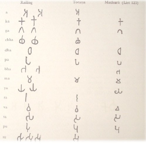
Letter bha : In the old type the right vertical of the letter is of equal length with the left one;
later on the lower part of the of the right vertical is elongated.
Letter ma : In later times a tendency towards angularization is obvious.
Letter ya : The old type is that of a vertical standing upon a horizontal crescent, sometimes
high-curved. Later on the letter resembles an anchor.
Letter ra : The old type is a straight vertical stroke with equality thick ends; later on the
upper end gains in the thickness, and the letter looks like the blade of a sword. An
old variation has the vertical stroke curved like a corkscrew.
Letter va : As in the letter ma a tendency towards angularization is obvious in later times.
Letter sa : In the younger type, as with letter pa, the right vertical stroke is lengthened
and nearly equalized to the left one.
Letter pu and su : In the earlier type the u─ mark is applied towards the middle part of the
letter, in the later type in continuation of the right vertical.
|


